The time has passed so quickly and today is the last post for Create with Connie & Mary Summer Edition. I have had such a great time creating projects for the members and for the challenges each week. For the last five weeks we have been featuring some of the new stamp sets and products from the Stampin’ Up! Summer Mini Catalog. This week our featured items are the Sweet Scoops stamp set, July Fourth stamp set, Red/White/Blue jumbo wheel, and the King of the Grill stamp set. Our last challenge is a special Theme Challenge to create a Summer Invitation.
This week I have been working with the Sweet Scoops stamp set – there are so many little techniques you can do with this stamp set. In my weekly project I should the Kissing technique and for my challenge card I used two more fun techniques – Baby Wipe and Rock and Roll.
 I tried several different things before I finally ended up with this card. I even debated creating an invitation that matched the Ice Cream kit from earlier this week, but decided I wanted to show you something different with this same stamp set. I’m so happy with the final result! I really like how it turned out.
So first of all this is a tall card – one that fits in the small open-end envelopes instead of the medium envelopes. The card base is Pretty in Pink – a 6″ x 6″ piece folded in half. The panel in the center is Kraft card stock that was embossed with the new Square Lattice Embossing Folder. I love this folder and the picture in the Summer Mini catalog does not do it any justice – I never even considered it until I saw samples with it.
The top and bottom of the card are done the same – I used a piece of Kaleidoscope Designer Series paper with one edge torn and layered it on a piece of Close to Cocoa that has one edge torn.
Now some of the fun is making the ice cream and the cones!
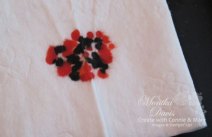 For the ice cream I used the Baby Wipe technique – take a baby wipe and fold it into quarters and set it on something plastic – I use one side of my Stampin’ Scrub with the pad removed. Using reinkers in Pretty in Pink and Close to Cocoa add drops to the baby wipe. You are basically creating a multi colored ink pad. Then use that to ink your stamp. I stamped on Whisper White card stock. Each one will turn out a little different as the ink blends together.
 For the cones I used the Rock and Roll technique. To do this I inked the cone in Creamy Carmel ink and then rolled around the edges using Close to Cocoa. This gives it shading around the edges of the cone.
I cut out all the cones and ice cream and then these are added to the front of my card with Stampin’ Dimensionals.
The “you’re invited” banner is stamped and punched with the Modern Label punch. A second Modern Label punch is punched from a piece of Pretty in Pink – cut in half and then each half is layered behind the white one. I used a marker to add some stitching around the edges.
 I added a couple of other fun elements – first of all the Bitty Buttons! I just love these little buttons. I used Itty Bitty Shapes punch pack to punch out Close to Cocoa card stock and layered each one behind a clear button. Pierced with a paper piercer and added linen thread. I put the whole card together and then the really fun part starts. I sprayed my whole card with the Vanilla Shimmer Smooch Spritz! So everything is covered in shimmer!
 I also stamped on the envelope with the ice cream and cone. The party invitation information is on the inside of the card. This would be fun for a back to school ice cream party or summer birthday. Ryan has a summer birthday but I don’t think he would appreciate the pink invitations!
Check out what the other Create designers did with this theme challenge:
Connie Babbert – Inspired Treasures
Kerin Sylvester – Stamps, Paper, Glitter
Mary Brown – Stamper Camper Corner
Supplies:
Sets: Sweet Scoops (117078w, 120078c), Family Phrases (114960)
Inks: Close to Cocoa classic (103139), Pretty in Pink classic (101301), Creamy Carmel classic (103220), Close to Cocoa ink refill (102444), Pretty in Pink ink refill (102295), Close to Cocoa Stampin’ Write Marker (100072)
Cardstock: Close to Cocoa (101341), Pretty in Pink (100459), Whisper White (101731), Kraft (102125)
Accessories: Big Shot Die-Cut Machine (113439), Square Lattice Embossing Folder (119976), Modern Label punch (116630), Paper Piercing tool (116631), Mat Pack (105826), Kaleidoscope Designer Series Paper (115680), Bitty Buttons (118761), Itty Bitty Shapes Punch Pack (118309), Vanilla Shimmer Smooch Spritz (118772), Color Catcher (121093), Linen Thread (104199), Stampin’ Dimensionals (104430), Small Open-End Envelope (107286).

 For this one I used the Write Stuff Specialty paper – I originally didn’t think much of this paper pack but as it turned out I really like the paper designs that were in there. They work well for boy stuff – just dots and checks and stripes – no flowers. Almost every pack of our Designer Series paper has a flower somewhere in it and I want some with just stripes and geometric patterns.
 I’m looking at this picture and trying to figure out how I got the staples in so far – I guess that was the reach of the stapler because they do go all the way through to the inside – maybe I shouldn’t have done that – it left the backs visible on the inside.