Jun 7, 2010 | Almost Artisan, Big Shot, Bleaching, Cards |
And I’m continuing on with my projects that I created for the Stampin’ Up! Artisan Award Contest. This is another card that I made. I know it is the wrong season for this winter card but I love how this technique turned out. I originally used this on a scrapbook page and decided to create a card for the contest using the same technique.
 This is my bleached snowman card. I love the snowmen in the Holiday Lineup stamp set. They are just so fun. I cut out a Top Note with the Big Shot from Close to Cocoa card stock. I stamped the snowmen with Chocolate Chip craft ink and embossed them with clear embossing powder. This makes what I call little “walls”. Then I used fresh bleach in an aquapainter (I have one that I only put bleach in). And put bleach on the places that I wanted to be lighter – the snow parts. The bleach on the Close to Cocoa gives a Very Vanilla shade rather than white so the rest of my decorations were in Very Vanilla. The “walls” help keep the bleach from seeping into sections that you don’t want bleached.
 The background is stamped with the snowflake from Tree of Friendship using Very Vanilla Craft ink. I also pulled the edges of the card across the ink pad to add some color there.
The card itself is not a traditional card opening. Instead the two end fold up to the center and the Top Note with the snowmen hangs over the front. The picture on the left shows you what the card looks like when it is opened. The inside panel was also decorated.
I added some Bashful Blue Designer Series Paper, a punched Very Vanilla Snowflake, Very Vanilla Satin Ribbon, and a Chocolate Chip corduroy button all tied together with some Linen Thread.
My pictures are a little bit dark but I think you can see it all.
I think so far I’ve shown 6 of my 10 projects. I hope you’ll be back to see the rest.
These snowman look so cool on a hot day – we have bright sun today and a perfectly blue sky – not a single cloud was out this morning when I walked. And Kyle walked with me – we went all the way around our big neighborhood loop. I had forgotten how big those hills are. I think we walked about 45 minutes. Then I took Ryan to tennis camp. I have a workshop tonight at Kimberly’s house – going to pack up for that now – it should be fun! And yesterdays Simply Adorned class was great. I can’t remember if I have shared those ideas with you or not – I’ll have to do that this week too if I haven’t already done that.
Thanks for stopping by today – have a great day!

Jun 6, 2010 | Almost Artisan, Big Shot, Scrapbook Pages |
I took a few days break from posting my Artisan Award entries but now I’m back to showing you a few more. Today is my second of three scrapbook pages. All of my pages were 12×12. This is a really fun and bright page. I don’t often use the Bold Bright colors but I did on this page and guess what now most of them are retiring so perhaps that wasn’t a good decision.
 I guess I may never know what they didn’t like about my projects.
This one I thought had a lot of creative elements to it. The base is Real Red. Then I added a large panel of Tempting Turquoise along with some strips of Summer Sun for the title and the bottom edging.
 The title has a bubble gum border made with just punched out circles. I added a white gel pen highlight on each one. The letters are cut using the Big Shot and the GoGo Boots Alphabet Die. In every closed area of the letters I added a colored piece behind it also with the white gel pen. I did realize one thing after it was finished – I put the gel pen highlights on opposite sides and should have had them all on the same side to show the imaginary light source coming from one direction.
 The photos were added with this fun flip book concept. There are three flaps with photos on both sides. They are attached to the page with some of the Bold Bright Brads.
 Each flip page also has a tab with some short journaling – “BLOW”, “POP”, or “YUCK”!
The pictures are just some random photos I took one day when Ryan was in my craft room and trying to see just how big he could blow a bubble. I was able to get a series of photos so it worked well with the flip pages.
 I even got the big bubble popping and them where he was trying to clean it off of his face! Yuck!
 I also added a Bubble Gum machine that was made into a shaker box – the front has a window sheet on it with a bunch of punched out bubble gum pieces on the inside. And then at the bottom I had a bunch of pieces looking like they just fell out of the bubble gum machine.
It reminded me of the little chant (or rhyme or game or whatever you call it) – Bubble Gum, Bubble Gum in a dish. How many pieces do you wish?
Does anybody else remember that? Ryan stuffed his mouth full trying to get a big bubble.
Well that is my fun colorful scrapbook page! Have a fun colorful rest of your weekend.
Thanks for visiting me today.
Jun 5, 2010 | Cards, Create with Connie & Mary, Decor Elements, Smooch Spritz techniques, Stamper's Club, Summer Mini 2010 |
Hey everyone it’s Saturday and no I don’t have another challenge card for Create with Connie & Mary. The summer session of posting new projects and challenges has ended. But if you are looking for some GREAT ideas on how to use your summer mini stuff, you can still subscribe for $24.95 and have access to ALL the GREAT ideas that were shared.
And guess what Connie & Mary are continuing to do weekly challenges that are open to everyone! They will be posting on Thursdays – and the first one was this week. I hope you’ll visit the Create with Connie & Mary blog and try to play along. I will when I can fit it in.
So on to my card for today. Last night was my Stamper’s Club meeting – we normally make three projects – 2 cards and a 3D. This was one of the cards we made – it looks so much harder than it is. The card was designed by my friend and upline Wendy and uses several products from the Stampin’ Up! Summer Mini catalog.
 It has a masculine look to but also looks elegant and vintage at the same time. So i think you could use for a variety of things – Father’s Day, Anniversary, etc.
The card base is Basic Black – which is a little hard to see in the photo because it kind of disappears into the background.
Then you need two Whisper White pieces – one for the front and one for the inside so you have a place to write. So here is a fun technique that you can do with the Smooch Spritz . Use a plastic project folder like you use for a school report – spritz inside the folder – Silver Foil – you could also add the gold if you want. Close up the folder and smoosh the spritz around a bit. Open it up and lay the two pieces of white card stock back to back inside the folder. Close it again and smoosh the spritz on to the card stock. Take the card stock out and you have the marbleized looking pieces. Each person will get a different looking piece.
Then add the Decor Elements stencil to the front – the stencil is called Mostly Vintage and it is in the Summer Mini. Use a Stamping Sponge and Jet Black StazOn ink and add the stencil to the front of the card. Remember to pounce the sponge and don’t rub or you will bend the little pieces of the stencil.
To finish add one of the little vintage tags that are in the Summer Mini. I hope you like it.
Jun 4, 2010 | Big Shot, Cards, family, Graduation |
I don’t think I ever shared the Mother’s Day card that I made for my mom and Greg’s mom. I thought I would take a break from my Artisan entries and do that today.
 This is not my idea. I don’t know who originally created the pansy idea but I followed the directions from Dawn.
I used the Shimmery White card stock. Punch out with the Butterfly Punch – who would have thought it was the butterfly punch! You need two butterfly punch outs for each flower.
 Spritz with water and then use an AquaPainter and the classic ink refills to add the color. I used Rich Razzleberry on the outsides and Summer Sun in the centers. I curled them with a skewer, added lines with a marker and put the silver brads in the center.
I wondered if I should have turned them over and added color to the back of the flowers too since you can see the back side when it curls – but I didn’t think about it at the time – only now that I’m looking at the pictures.
The Rich Razzleberry layer is embossed with the Square Lattice Embossing Folder and the Big Shot. The leaves are the Little Leaves sizzlit die for the Big Shot. I think the layout from this card also came from somewhere else but it has been a while since I first made it so I don’t remember exactly.
I thought I would also share a quick proud mom moment – these are pictures from Graduation last weekend.


We sat up in the balcony at the church – which is huge – so I wasn’t expecting to get a good picture of him on the stage – but this one as he is coming down the steps turned out pretty well. The other one is outside afterwards – it was about 10 at night when they finished and raining outside – luckily they have a large covered area at the church where everyone gathered. The kids tried to throw their caps but they really couldn’t do that under the cover. Oh well…
Have a great day – I have Stamper’s Club tonight – I’m looking forward to seeing my stampers again!
Jun 3, 2010 | Almost Artisan, Big Shot, Designer Series Paper, Occasion Mini 2010, Scrapbook Pages |
So far you got to see some of the cards I entered in the Stampin’ Up! Artisan Award contest. Well I thought I would switch gears and show you a scrapbook page today. I think this one is my favorite out of the three I made.
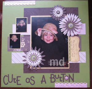 This is my niece Ally – isn’t she just Cute as a Button?
I have actually used these pictures before on another page. They were fun and I had a whole bunch of her playing with this old hat. I used one large picture for the focal point and then added the two smaller photos on the side.
The base is 12×12 Old Olive Textured card stock. I used a piece of Chocolate Chip card stock and stamped it with the Manhattan Flower using Versa Mark ink and embossed it with clear embossing powder. An easy way to create a tone on tone background. The photos are framed with So Saffron card stock.
 I used the Flower Daisies #2 die and the Big Shot to create the flowers. There are multiple layers of the Sweet Pea Designer Series paper that was in the Occasions Mini catalog. The centers are the little Chocolate Chip Epoxy brads – I love those!
 The title was also cut with the Big Shot and the Go Go Boots Alphabet Sizzlits die set. I use that one a lot in my scrapbooking because the letters are fun and different sizes. I added the little designer button inside the ‘O’ – I thought it was a perfect little touch.
There are a couple of pieces of Pretty in Pink on the edges punched with the Scallop Trim Border Punch that we had in the Sale-A-Bration brochure – but it will be back in the catalog on July 1st! I added doodling on this page too like I did on the card I showed earlier. 
I used the Top Note die for my journaling. I think that is probably where I lack on my scrapbooking is the journaling part. I’m not a good writer so I only had a very small amount of writing on each page and that probably wasn’t enough for the judges – I needed to tell a better story on my pages. I’ll have to work on that part this year.
I really liked this page and it was fun to create. Maybe I will have to make a duplicate since I sent my only one to Stampin’ Up!.
Remember to visit this post to see some of the other talented demonstrators that submitted entries to the Artisan Award Contest but didn’t win.
Thanks for stopping by today. I forgot to download my turtle pictures sorry about that.
 This is my bleached snowman card. I love the snowmen in the Holiday Lineup stamp set. They are just so fun. I cut out a Top Note with the Big Shot from Close to Cocoa card stock. I stamped the snowmen with Chocolate Chip craft ink and embossed them with clear embossing powder. This makes what I call little “walls”. Then I used fresh bleach in an aquapainter (I have one that I only put bleach in). And put bleach on the places that I wanted to be lighter – the snow parts. The bleach on the Close to Cocoa gives a Very Vanilla shade rather than white so the rest of my decorations were in Very Vanilla. The “walls” help keep the bleach from seeping into sections that you don’t want bleached.
 The background is stamped with the snowflake from Tree of Friendship using Very Vanilla Craft ink. I also pulled the edges of the card across the ink pad to add some color there.